I didn’t have my own computer until I turned 18. But that did very little to curb my enthusiasm for video games. I’d camp out at my friends’ places, taking turns to play and watch video games for hours. And watching my friends play wouldn’t bore me. I would sit there analyzing and sketching the characters, environments and graphic effects. Years have passed and video games have changed, but I still find myself pulling apart game videos. It is entertaining to see how the creators came up with the visuals and concepts. To figure out what makes some games stick where others fall off the radar.
Last weekend, Konami released gameplay footage from their new release Metal Gear Solid: Survive. I am not a fan of how the company is treating its employees and co-creators. But I liked what I saw in this video, and am reviewing it from a design/art direction POV.
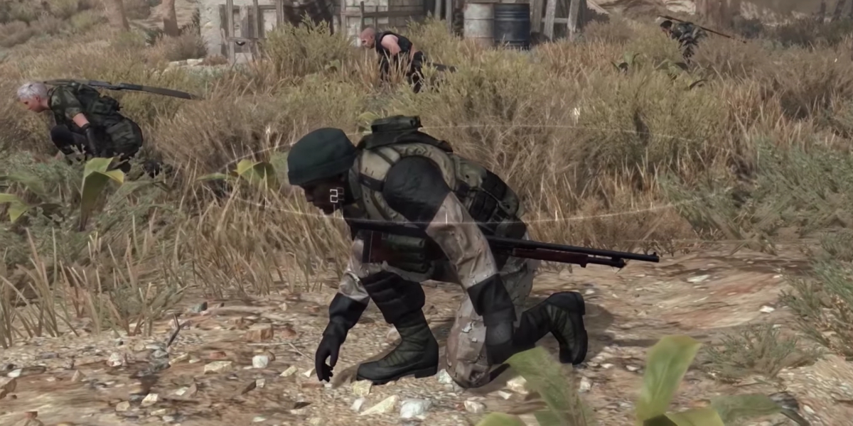
Metal Gear Solid: Survive is co-op survival action game where soldiers are trying to survive after being transported to an alternate reality, to find a world full of hostile creatures. The gameplay starts with the four characters teleporting into the spawn point. The primary character that we focus on, is a black guy in desert fatigues.

This is downright revolutionary. It immediately sets the game apart from ones that show these perfect-sculpted white protagonists. I can relate to this dude, and can see him as a hapless soldier stranded on this alternate reality. It also shows that the game caters to a wide audience, and there is a lot of scope for character customization.
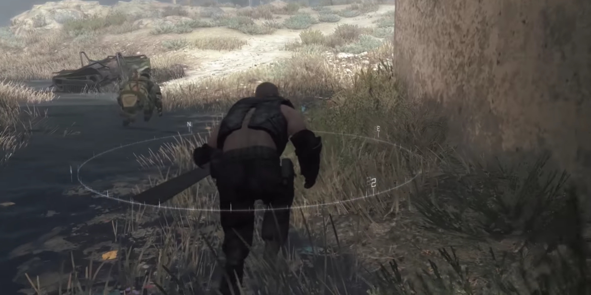
The character strides feel human. They feel like Spec Ops. These people are trying to survive, so it would make sense for them to avoid unnecessary movements and conserve their energy. It would be silly if they keep breaking into gymnastic pole-vaults for every tiny fence.

There is a neat circle hovering around you that acts as a compass. Though a bit distracting at first, I found it helpful as the mission progresses.

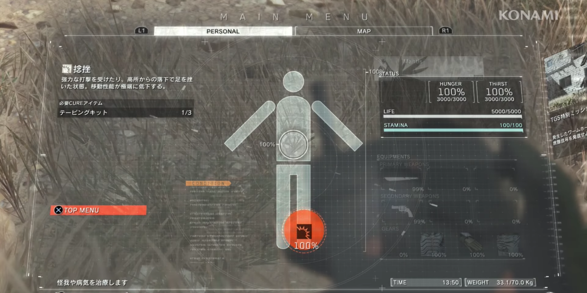
The in-game menu follows a clean layout. The design components are set on a subtle grid, and have a sophisticated feel. Instead of having realistic illustrations of your character, they have used pictograms. Sections light up within the pictogram to show damage and the subsequent health recovery.
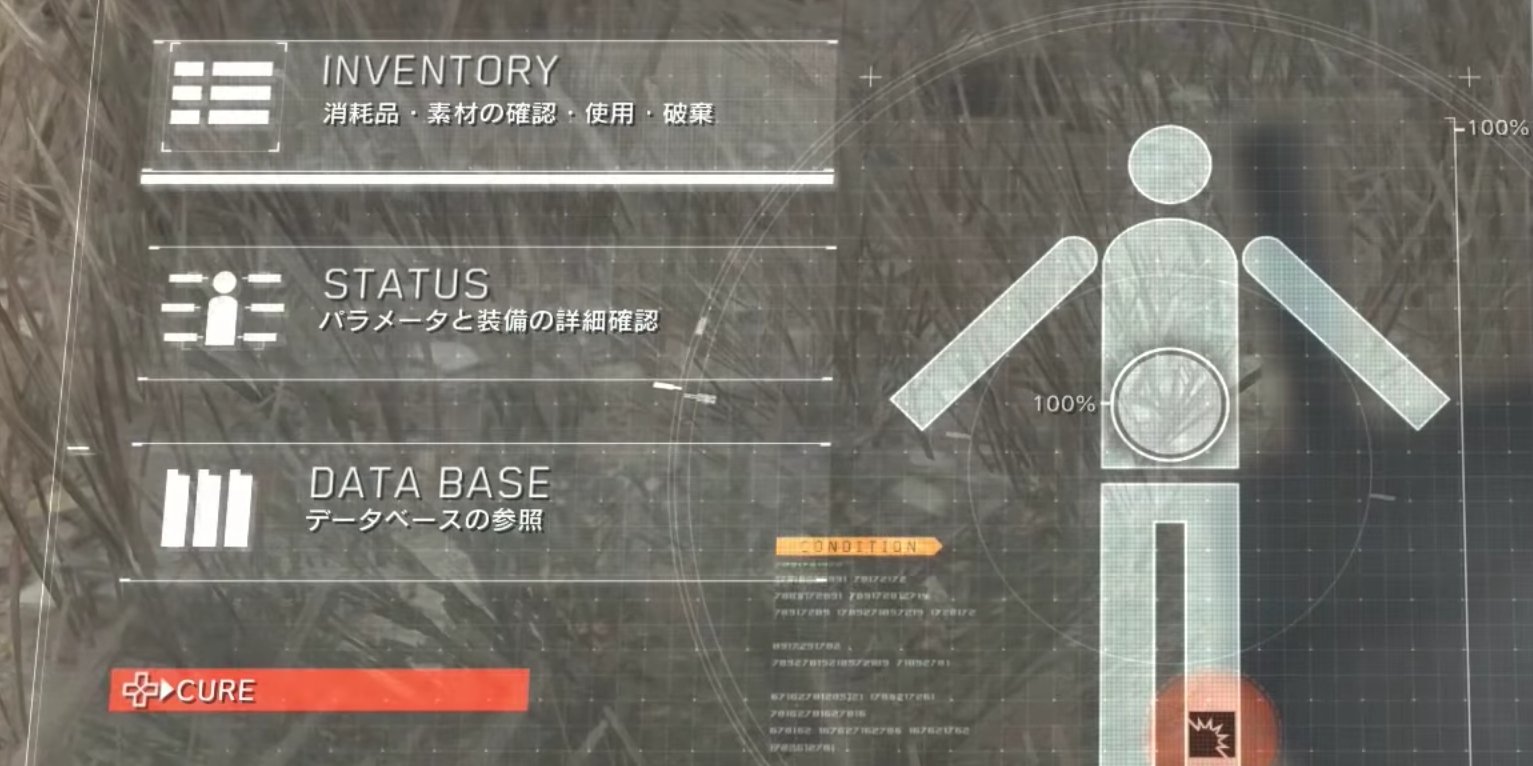
The icons for Inventory, Status and Database aren’t too literal. A lot of times, games try to one-up each other by adding more 3D effects, gradients, glows, etc. These effects make the game files heavy, increasing the load time for the frames. This can cause lag and screw with the users’ experience. The visual language used here is elegant and has the potential to elevate the way experience design is used in video games.
I love how the thumb moves in the blurry background while we move around the menu. Definitely makes me feel like I am the character.
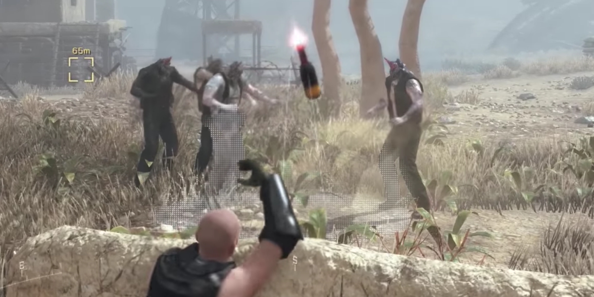
Ballistics and the area of effect for molotov cocktails is shown through a dot-matrix overlay. This is an elegant use of subtle graphics that inform without cluttering your HUD.

The environment looks dystopian but familiar. This is because a lot of assets from the MGS 5 Afghanistan map have been copy-pasted onto this terrain.
The alien beings that look like Headcrab Zombies from Half Life are referred to simply as ‘creatures’ (くりーちゃー or Kuriichaa). This seems a too literal, and kinda silly. Naming these monsters thus would make more sense if we look at this from a Japanese point of view. The Japanese prefer transliterating English words into the Katakana script over finding native alternates. So, saying Kuriichaa (creature) would be easier. Over something like Supaiku Heddo (spike head) or Heddorasu Eiriian (headless alien).

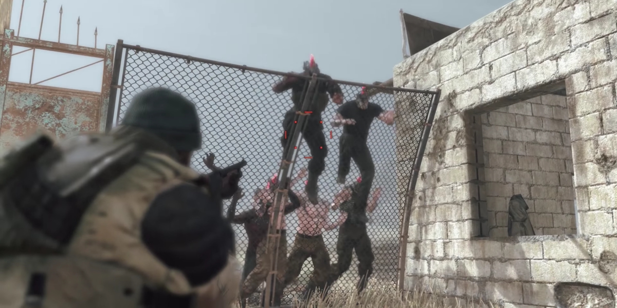
You can install fences to barricade your path, which bend under the attack of the creatures. This was a great way to show the loss of durability, instead of using health bars.
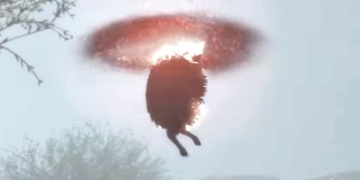
Also, I kinda feel bad for this sheep. It looks like it’s getting sucked into a hellish incinerator. :’(

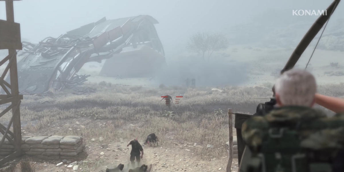
Also, bows.

They haven’t shown a perfect execution of the mission. The team actually ends up losing and retreating. Watching this video sparked a “I can totally kick ass and play this game better than these guys” feeling in me. This is a nice subconscious ‘hook’ that the marketing team could have planted in there.
All in all, very Solid.
